Measures and Policies

View cases and measures timeline and read a short analytical piece on Qatar by clicking here.
Visualizing data and statistics on COVID-19 cases and other measures is an important tool for analysis and a deeper understanding of how the pandemic is being experienced by countries in the region.
The current pandemic, which is caused by the novel coronavirus has precipitated various responses and measures from governments across the globe. With the flux and rapidly evolving situation, there is a pressing need for up-to-date information on the proliferation of policies and government decisions to contain the virus. The situation in the Middle East is no different, with an increasing number of confirmed cases and deaths due to the virus recorded, new policies and state directives are issued on a daily basis.
This page will be dedicated to a cross-country (Bahrain, Iraq, Kuwait, Oman, Qatar, Saudi Arabia, and UAE) comparison of some of these policies and measures. COVID-19 case statistics were last updated September 14, 2020, at 09:50 (GMT +3). Measures and policies information was last updated August 20, 2020, at 17:00 (GMT +3).
The interactive chart below highlights the various containment measures taken in the 7 countries under study, to curb the spread of the virus. Hover over each colored circle to view the policy measures of each country.
As part of the containment measures, various coronavirus contact tracing apps were launched by the 6 GCC states, as a tool to trace the spread of the virus, release daily updates on statistics and government policies and provide e-government services related to COVID-19. The table below provides information on these COVID Apps. Click on the map icon to read a summary of the app’s functions.
The illustration below tabulates the total population of each country as well as the concentration of people living per sq. km of land area (data from 2018). The size of the circle represents the population size and color density annotates the number of people living in close quarters.
The table below provides numerical summaries of the health systems across the countries under study. The following bar chart provides details on the field hospitals and additional bed capacity built in response to COVID-19. Hover over the individual bar to view details for each country.
The interactive map below illustrates the total number of cases, deaths, recoveries, and density of confirmed cases as compared to the population of the 7 countries under study. The size of the circle indicates the total number of cases in that country. The color of the circle indicates the density of the numbers of confirmed cases to the total population in each of the countries. The following two bar charts provide statistical analysis of the recovery and mortality rates (per 100 cases) and compare the numbers (of cases, deaths, recovery, and patients in hospitals and ICU) across each country. The last graph provides details on the number of COVID patients currently seeking treatment in hospital and ICU.
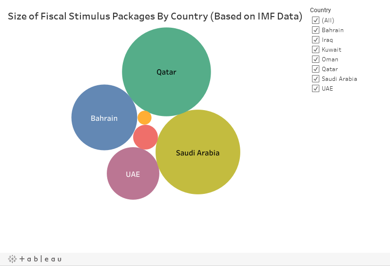
The following charts measure the economic responses and investments made by governments of the 7 countries to limit the economic impact of the COVID-19 pandemic. The size of the circle illustrates the monetary amount of the fiscal stimuli. The bar chart shows the percentage of the fiscal stimuli in relation to the GDP of the country. The data used in this visualization is from the International Monetary Fund (IMF).

Data Visualization created by former CURA Research Fellow, Ngoc Nguyen.